


Howdy fellow sublimation peeps! In today’s post, we’ll be focusing on some that few people understand but it makes a HUGE difference in your print quality: Epson Sublimation Paper Settings.
Most sublimation users just use Premium Presentation Matte for the most ink, but what if you have extra ink causing issues? Going to a lower setting really seems to adversely effect the color. In our test today, we’ll waste our time, ink and paper to test so you don’t have to!
Here’s the full video:
Why do paper setting affect my output?
Paper settings directly change how much ink the printer is putting down based on the amount the printer expects to be absorbed by the print. The best analogy I can think of involves printing on strange objects on different ends of the spectrum. You’re were pouring black ink onto a porous, absorbent object, such as a sponge. How much ink do you think it would take to make the sponge has a nice, crisp black color? Probably quite a bit. Now, let’s contrast that with something non-porous, such as glass. How much ink do you think it would take for the ink to show up on glass? Not much at all, as the glass isn’t absorbing the ink. Make sense?
While this seems irrelevant to the matter of sublimation, quite the opposite is true. By manipulating the epson sublimation paper settings, we can “trick” the printer into putting more ink down on the paper. More ink in the sublimation paper allows for more ink to be released into the substrate, allowing for much more vivid colors.
What are the different Epson sublimation paper settings?
In this “experiment”, we’re going to print one 8.5″ x 11″ of each design. As a control, we will use all of the same settings (High Quality, High Speed Printing Off,
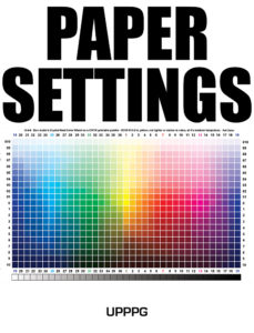
The design will feature a color chart and solid black text. This will be a test of how good the colors are and we will see how prone the setting is to streaks/wheel marks/etc. We will grade each one by comparing how vivid the colors are and how much ink is left in the paper.
If you notice, there’s a marker to avoid confusion later on. I have a feeling this will be important. These will be printed with my Epson WF-7720 printer. Once printed, we will be pressing on 100% polyester fabric, the smoothest I could find. This should be an adequate test for the Epson sublimation paper settings!
Results!
The results were quite shocking. Despite having 13 different print setting, there were only 4 different “groups”
Heavy Ink
- Ultra Premium Photo Paper Glossy
- Premium Photo Paper Glossy
- Photo Paper Glossy
- Premium Photo Paper Semi-Gloss
I feel like the Heavy Ink is just asking from problems with any type of saturated image, particularly black. This setting results in wheel marks in EVERY test print. I wouldn’t recommend using it. In addition, the blacks have a noticeable red tint when using any of these paper settings.
Heavy Ink with Reduced Red in Black
- Premium Presentation Paper Matte
This was similar to “Heavy Ink” but without the red in the black. The black had a more pure color and looked fantastic.
Light Ink
- Plain Paper / Bright White
- Letterhead
- Recycled
- Color
- Preprinted
- High Quality Plain Paper
- Envelope
The light settings, including one of my favorites: High Quality Plain Paper looked pretty good, but the dark color were noticeably more muted vs the “Heavy Ink” settings
Medium Ink with Reduced Red in Black
- Premium Presentation Paper Matte – With Standard Instead of High Quality
This may be my Goldilocks setting on hard substrates going forward. I feel like this will reduce a lot of shadowing while maintaining a good black color on most substrates. If you are running into wheel marks when printing, clean your rollers and switch the Premium Presentation Paper Matte with Standard instead of High Quality.
I did this one as a personal test, because I feel like it will be in-between High Quality Plain Paper and Premium Presentation Matte.
After pressing and testing for hours, here’s the data I came up with:
What should I use?
Based on those results, you can always get the most vivid colors while maintaining the best black from the Premium Presentation Paper Matte. If that’s the case, why not just use it all the time? Well, with sublimation, there’s a point where the substrate was absorbed the maximum amount of ink that it possibly can. Anything after this point adds addition ink, that has to go somewhere. Extra ink can often lead to blurry or streaky images, particularly on simple prints.
Here’s my general rule of thumb: I use Premium Presentation Paper Matte UNLESS the design is simple (text only) AND heavy on black saturation. If that the case, you can greatly reduce the chances of streaks, wheel marks, and other print issues by switching to Premium Presentation Paper Matte, but with High Quality turned to standard quality. If you’re still running into issues, you can use any of the following paper settings: Plain Paper / Bright White, Letterhead, Recycled, Color, Preprinted, High Quality Plain Paper, or Envelope. I hope this guide on Epson Sublimation Paper settings has been helpful!
0 Comments